Stop doing these 3 website conversion killers
I was listening to a podcast where the hosts were discussing entrepreneur Jason Fried who lit up the Twittersphere with a thread about how towel hooks trump towel bars.
My designer’s ears immediately perked up…
During a bathroom remodel, the interior designer asked which they'd prefer: towel hooks or towel bars.
After pondering for a moment, his response was: "Towel hooks of course!"
Why? Here’s what he said:
"Hooks take up no space. Towel bars suck up space.
Hooks hold towels no matter how you place them. Towel bars require towels to be balanced lest they slide off.
Towels naturally look good and drape well on hooks. Towels on bars require effort to display well.
Hooks can hold anything with a loop or a bend or a catch — loofas, shower caps, etc. Towel bars can’t hold nearly as much, even though they take up much more space.
Hooks can hold multiple towels at once, with enough air getting to multiple layers because of the uneven ridges that single-point hanging creates. Towel bars layer wet towels, leaving ones at the bottom or middle struggling to dry.
You can’t mount a hook crookedly. You can absolutely mount a towel bar unevenly."
— Jason Fried via Twitter / X
My POV?
I wholeheartedly agree with his reasoning, coming to the same conclusion years ago (and the days are numbered for the last remaining towel bar in my house).
But my main reason for being a towel hooks over bars fan is this:
Hooks are the path of least resistance.
What I mean is, they require the least amount of work.
The path of least resistance is what humans and animals always seek out, making it a Universal Design principle.
How often do people not bother with a towel bar because of the folding and draping fuss?
Often! They toss towels over the edge of the tub or on the floor because people don't want to bother with getting it over the towel bar.
My 3 boys would try to hang towels on the corner of the towel bar because they didn’t want to bother otherwise. (even been guilty myself...)
A hook? Simple!
It's no more work to hang that towel on a hook than it is to throw it on the ground.
It's the path of least resistance.
The humble towel hook elevated to a symbol of "form follows function."
Jason Fried goes on to apply the principle of hooks versus bars to product design:
“We aim to make hooks. Simple, flexible, you-can’t-do-it-wrong hooks. Hooks that just work, no fuss.
When working on new products, new features, and improving existing stuff, I’m visualizing the “hook-ness” of what we're building.
Making small, flexible features with minimal surface area that can be used intuitively in obvious ways without the possibility of doing it wrong.
That’s the magic formula, that’s our model.
The unassuming, humble hook is a brilliant thing. The hook is a high bar.
(He scores bonus points for that last line.) 😁
We can apply what I’m calling the “towel hooks vs towel bars principle” to anything in business, right?
It’s an iteration of "form follows function.”
So let’s apply it to websites.
When website “towel hooks” are in fact, “towel bars”
Friction in the website client journey
The purpose of your website is to sell - whether its services or products. So your website needs to be a towel hook, not a bar - this is obvious.
Then the question is, what’s an example of a website “towel bar?”
Anything that causes friction.
Friction in sales and marketing means any obstacles or points of resistance that impede or slow down the customer's journey towards completing a desired action, such as signing up for a service, making a purchase, or signing up for a newsletter.
If we’re talking the actual towel bar, the friction is having to take the time to fold and drape that wet towel over the bar.
With websites, its anything that impedes a conversion - whatever it may be.
Let's look at 3 examples of website friction, and stick around for the last one because it’s the most important and least understood.
The website “ego entry”
The ego entry is my term for a site that gatekeeps a visitor from landing on the site itself.
Let me explain.
Instead of going directly to the home page (as you would expect) it instead has this pretentious “entrance” to the site that you have to click through first.
Some think of this as creating a vibe of “exclusivity” or even “luxury” but it's not. It’s just bad design.
Why?
Because it introduces friction. It’s the equivalent of holding up a STOP sign before they’ve even gotten to your landing page.
Instead of getting straight to your message, which is your biggest opportunity to pull them into your site and entice them to learn more about your business, these sites make people stop first and click some sort of “ENTER” button.
Why this is bad:
Each time your visitors are forced to stop and perform an action, you increase the odds they will say “forget it”, click away, and close out.
This "website entrance" page may look kind of cool but it's a hard pass because it makes visitors perform work to access your site which hurts conversions. (Plus it's bad for SEO, but that's a separate post.)
The hidden navigation bar
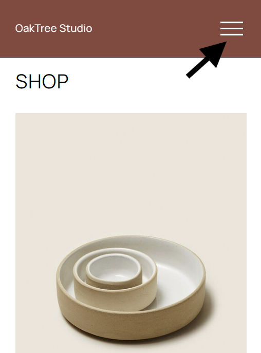
Instead of displaying the website’s main links across the website header, some sites, particularly creative business sites, will replace the header navigation with what’s called a hamburger menu (the layers seem hamburger-like…sort of…) You have to click the hamburger menu to reveal the website’s most important links.
Hamburger menus are necessary on mobile because all the links wouldn’t be readable across the top, but they aren’t needed on desktop.
I get why this seems appealing to the website owner. From a design standpoint, it looks clean and minimalist.
But I encourage you to think about it from the perspective of a cold lead who knows nothing about your business and has never visited your site.
When they land on your site, you want them to immediately be able to figure out what you do and what your website’s about.
Hamburger menus are needed for mobile viewing but don't use them on desktop in lieu of displaying your primary navigation.
This means the “above the fold” hero section of your landing page is your most important digital real estate on your entire site. (Above the fold refers to the top part of a page that can be viewed without scrolling.)
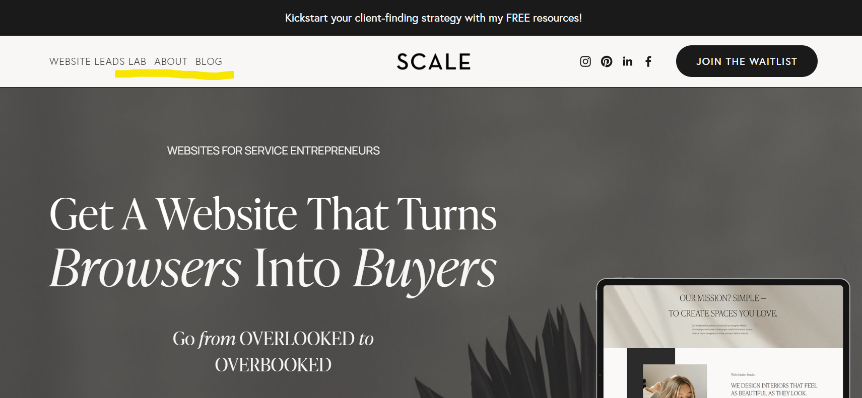
That includes your header navigation.
It may seem like a small detail, but to a new visitor, your primary navigation helps them figure out what your site (and your business) is about, at a glance. IDK about you, but I always scan the header navigation within a second or two after reading the hero section headline.
When your navigation is hidden in a “hamburger menu” off to the side, people have to figure out where it is and what it is, then they have to click on it before they can do any further exploring.
This introduces friction in getting your visitor to take the action you want them to take on your website.
Clear header links help visitors figure out what your site's about at a glance.
When design overpowers the message
This one’s less obvious - counterintuitive even, but it’s the most important.
People often think the more beautiful and visually dynamic the site, the better it will sell whatever it’s selling.
It goes back to the adage “If it looks good it is good.”
Obviously aesthetics are important. We ALL want to have a beautiful website - especially if we’re in a creative industry.
The problem comes when the visual elements distract from the site’s message.
For example, there’s a copywriter I know of who no doubt does great work. But I when checked out her website, there were so many visuals and animation going on, it overshadows her copywriting message.
And I'm being totally sincere when I say it's a gorgeous site; I’m not implying it's visually cluttered or anything like that. It’s a really beautiful, dynamic website.
The problem is the design is distracting from communicating the message of the business.
If the purpose of the site were to sell web design services to creatives, then it would be perfect, amazing - sign me up!
But its purpose is to sell copywriting. Words. And it’s much harder to focus on this copywriter’s message with all of the design and animated visuals going on.
Entrepreneur Sahil Bloom’s homepage isn’t as extreme, but it’s pushing it imho. It’s harder to focus on his words with the visuals going on, and honestly, the inset/outset animation you encounter when scrolling to each new section makes me a bit queasy.
What should be a design “towel hook” (beautiful website design) has turned into a design “towel bar” (detracts from the message).
Think I’m crazy? Let’s get even more extreme.
Try Googling “ugly ads convert better” or “ugly websites convert better”. Yep, there’s data showing less attractive websites and ads often convert better.
Before you throw your laptop at me though, let’s qualify this statement.
Here’s the REAL story:
What “ugly websites convert better” actually means is this:
Pared-down websites that minimize distractions typically convert better than overly designed sites.
The “ugly” site’s focus is on the message (because it has fewer design elements). This means the value proposition is more clear to the visitor.
Conversely, the more distractions the visitor experiences, the more dilute the value proposition and the lower the conversion rate will be.
So keep that laptop on your lap.🤷♀️
Again, we all want a beautiful website. But the truth is, your message matters most.
Therefore, your design elements should support your message, not distract from it.
So back to the beginning:
The goal is to create towel hooks, not towel bars.
Whether its a bathroom or your website.
So take care that your towel hooks are indeed towel hooks and not a towel bars.
P.S. - If you're interested in getting a website that will generate leads on autopilot - join the Website Leads Lab waitlist.


